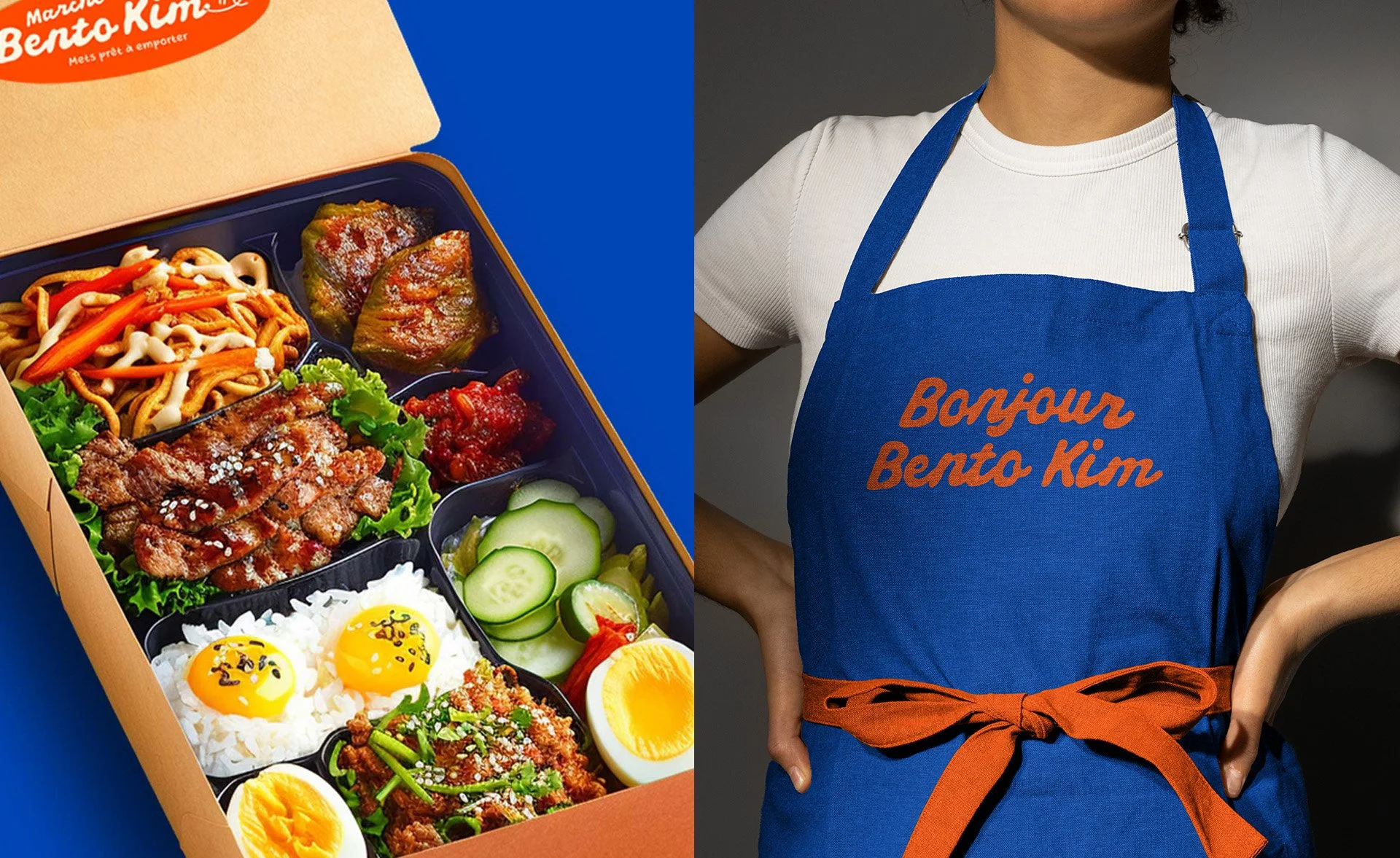
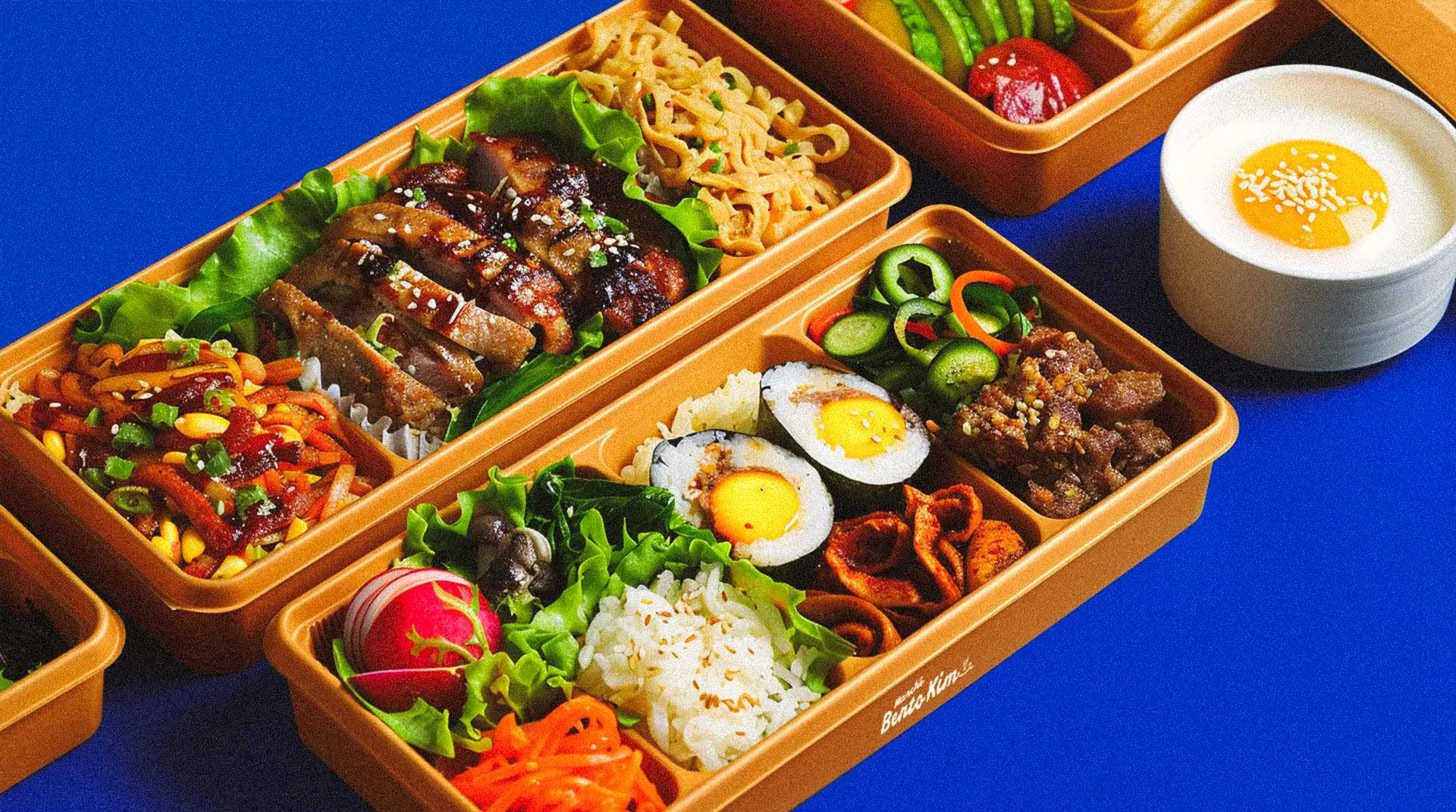
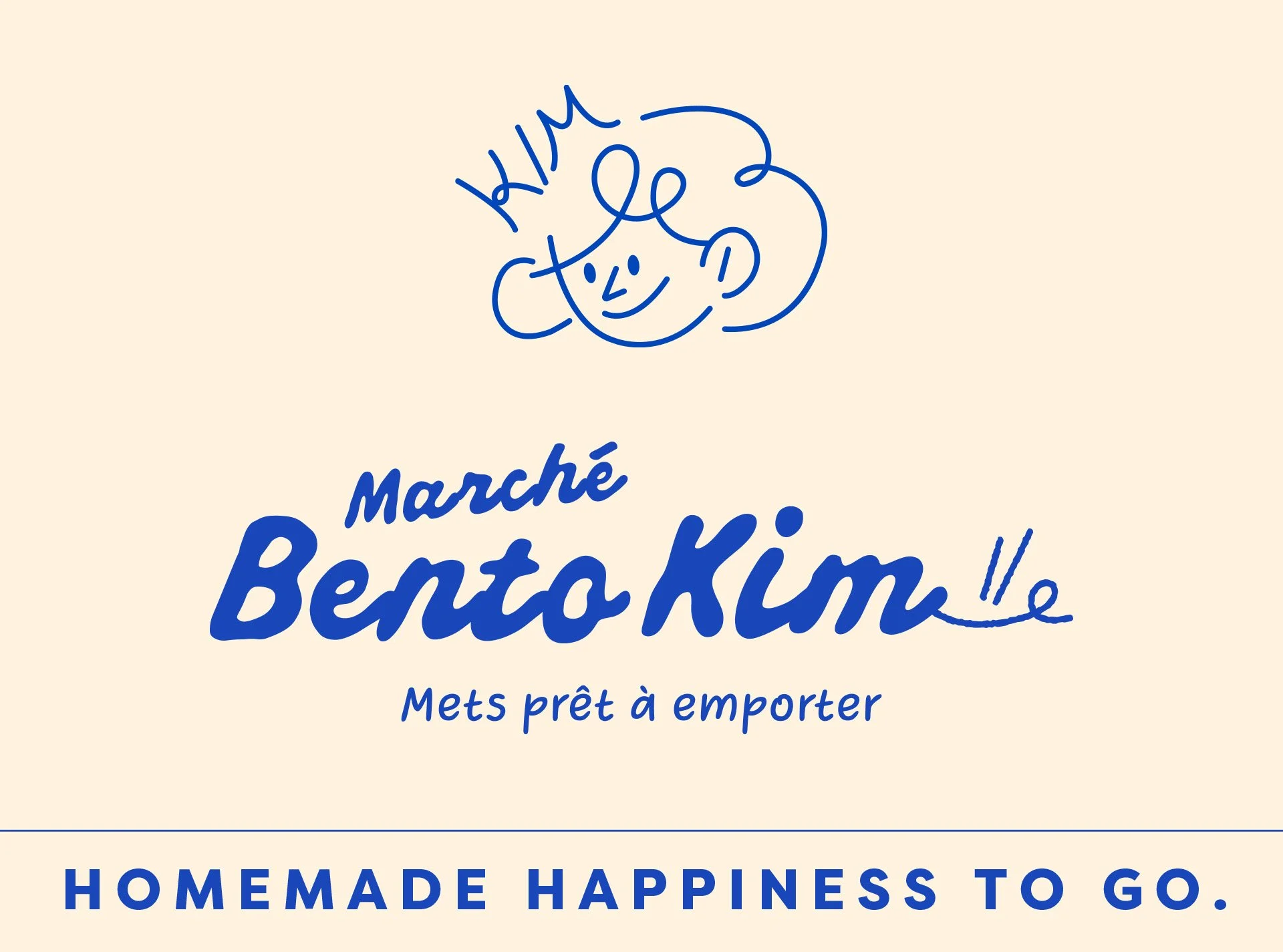
Bento Kim is a Korean bento brand located in Montreal’s Chinatown, created to offer warm, homemade Korean meals in a fast and accessible format. The concept is inspired by the feeling of a Korean mom’s home cooking, comforting, generous, and made with care. The goal was to bring this emotional warmth into a busy urban setting, appealing to both locals and tourists.
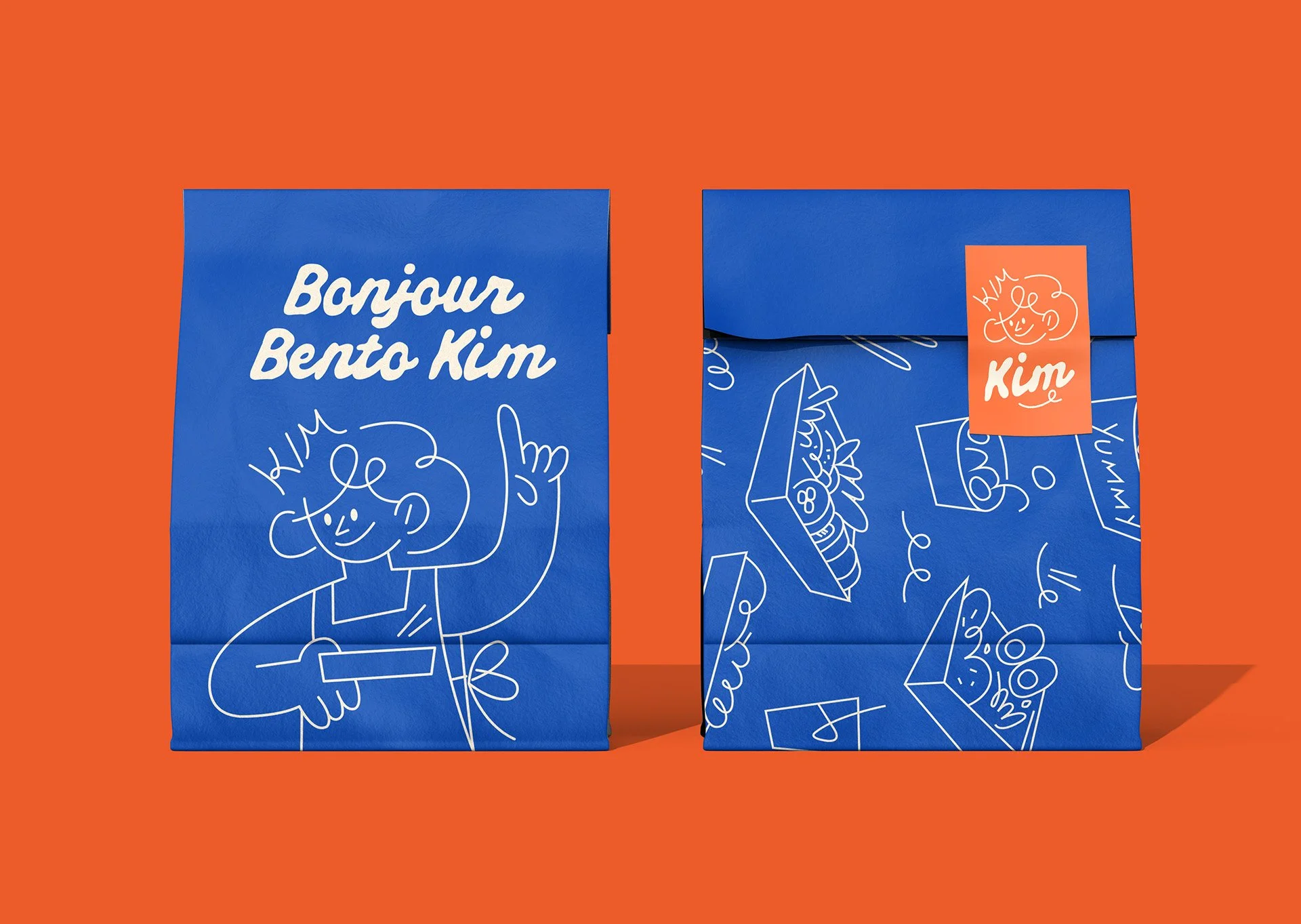
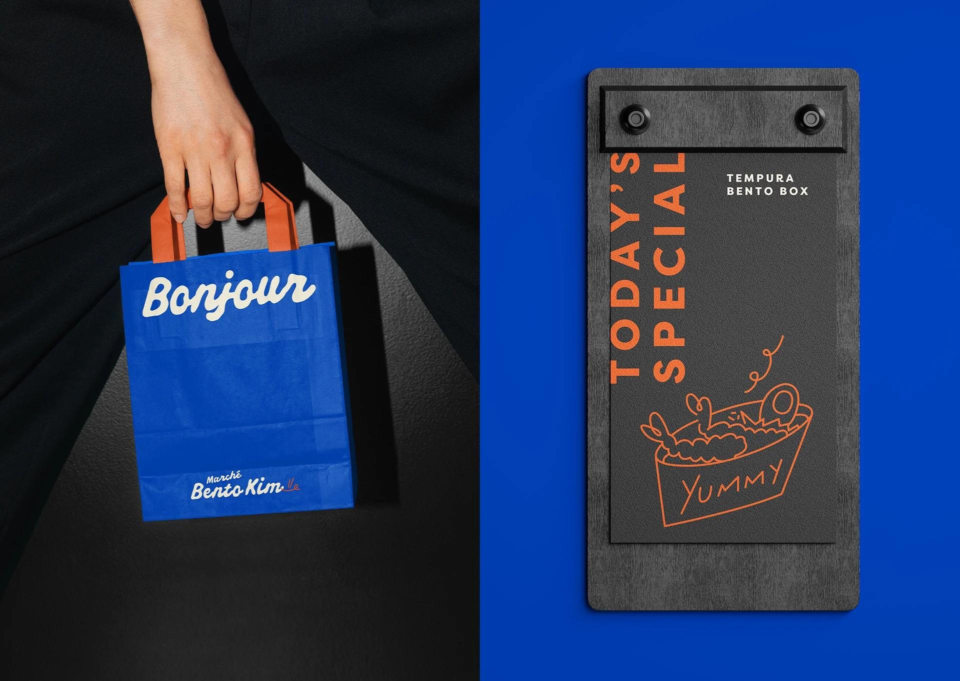
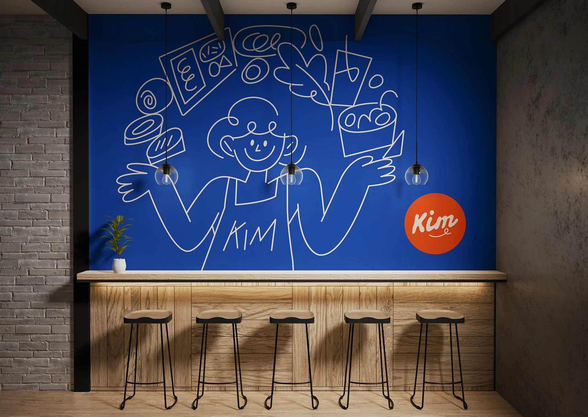
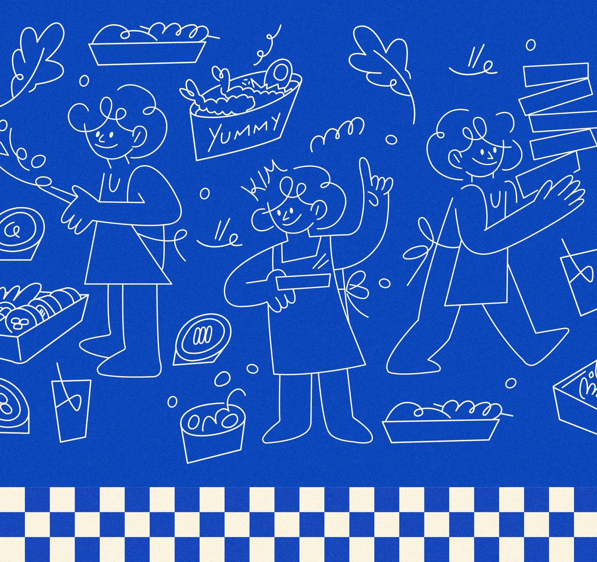
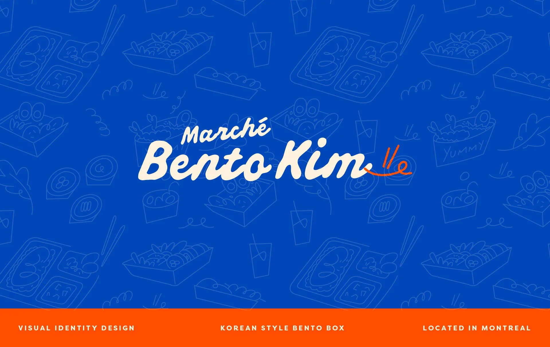
Our design approach focused on building a friendly and memorable brand identity that feels approachable rather than commercial. Instead of relying on a detailed mascot logo, we developed a clean wordmark and a set of supporting illustration elements. These illustrations express warmth, friendliness, and handmade quality, while allowing flexibility across packaging, interior graphics, and window displays. The visual system balances simplicity and character, helping the brand feel modern yet deeply human.
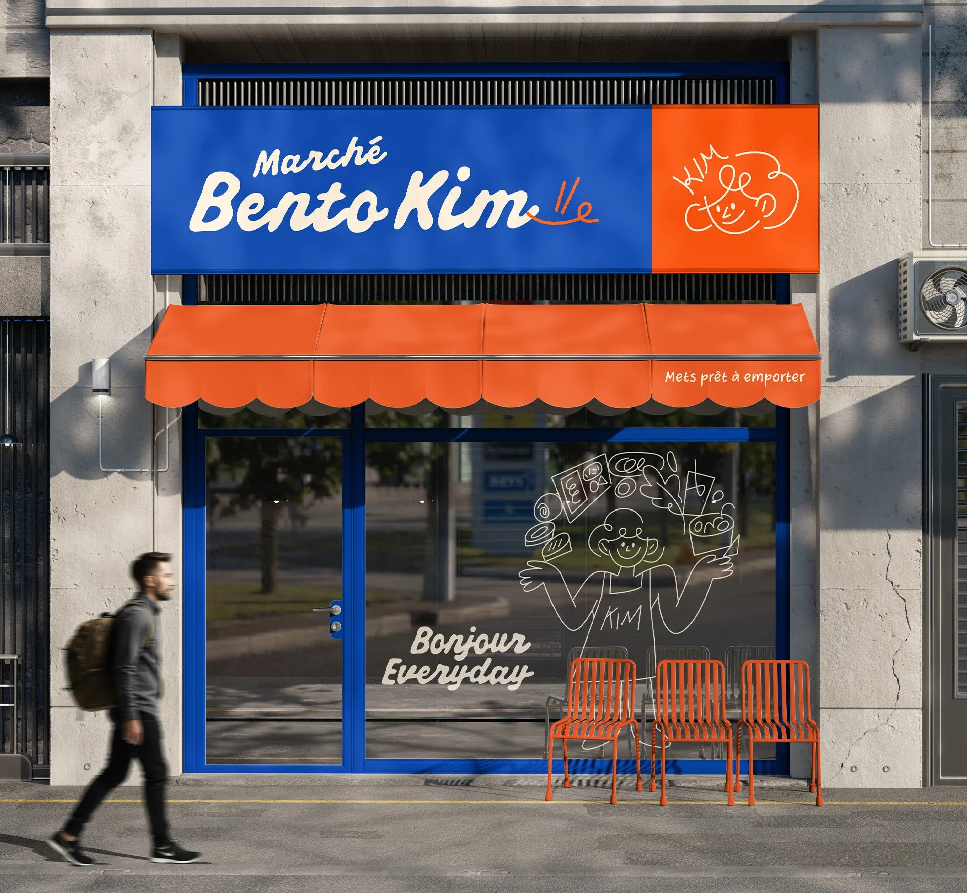
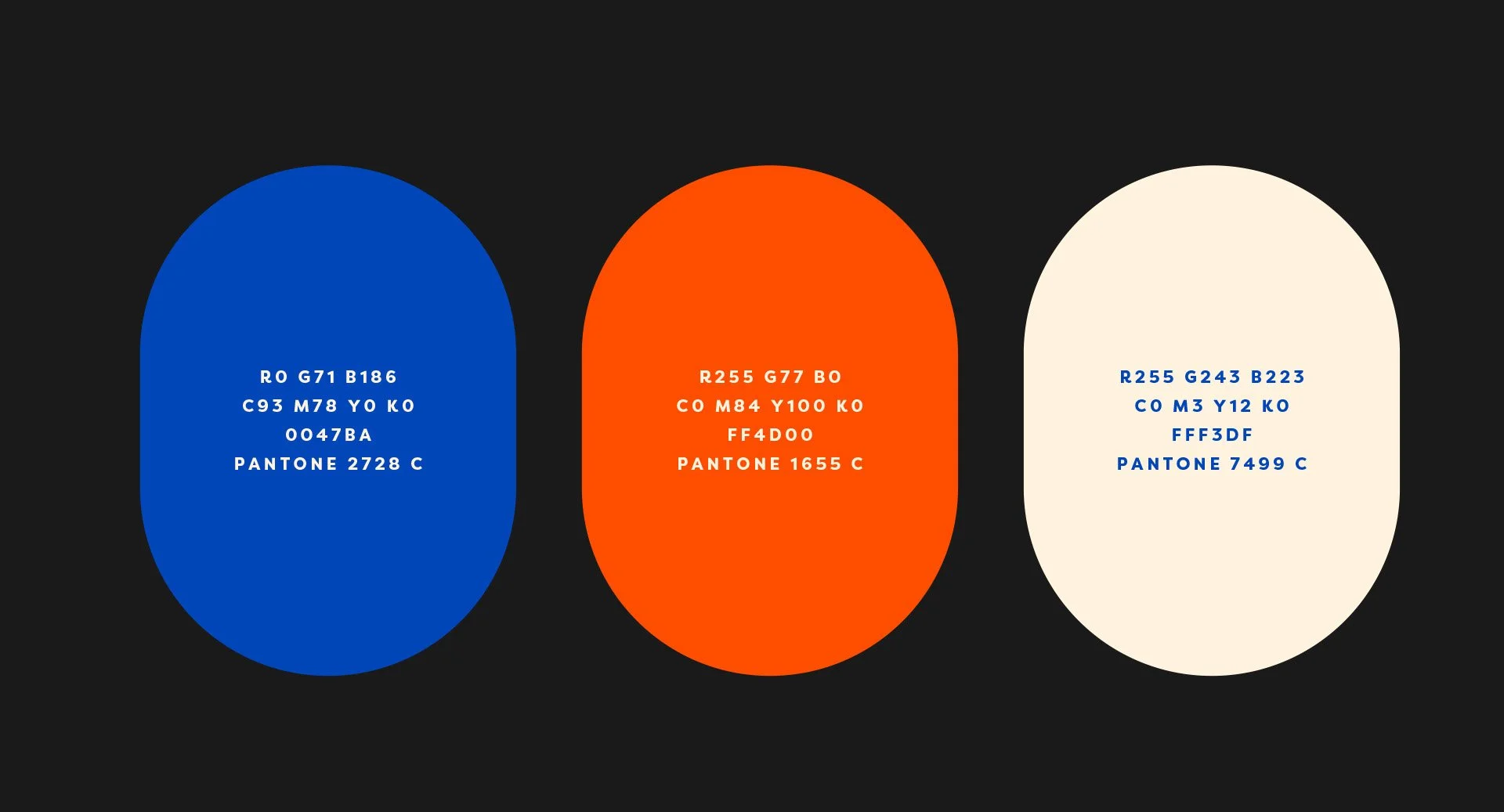
The color system is inspired by the strong visual contrast of the Korean flag, red, blue, black, and white, creating a bold and recognizable foundation. Instead of using a pure red, we selected a warmer orange-red tone to evoke appetite, comfort, and a homemade feeling. This adjustment softens the contrast while keeping the cultural reference, allowing the palette to feel both energetic and welcoming. The result is a color system that stands out in the urban environment while reinforcing the warmth and friendliness of Korean home-style cooking.